Basic blocks
About
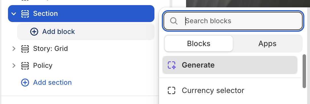
Every block in this theme is designed to work in any section, providing unlimited flexibility. You can mix text, images, buttons, and custom content anywhere in your store. There are countless blocks in the theme, but most of them are built from these base blocks.
Base blocks
| Block name | Description |
|---|---|
| Layout (Body) | Create a layout inside a section or an another block: grid, carousel, masonry. View Layout blocks |
| Layout item | A specialized block that exists only within the Layout (Body) block and wraps other blocks inside. View Layout item blocks |
| Group | Create a block that wraps other blocks inside, allowing you to customize the direction in which the inner blocks are arranged. View Group blocks |
| Text | Create a text block with customizable content, typography, and link. |
| Image | Create an image block with customizable image, size, animation and link. |
| Video | Create a video block with customizable video. |
| Button | Create a button block with customizable text, style. |
1. Layout(Body)
This is essentially the first basic block in a section, used to create layout types such as grid, carousel, and masonry, as well as to define the number of columns in those layout types.
Only Layout item blocks can be added inside.
2. Layout item
Used to wrap other blocks inside and control how many columns it spans in the layout.
Only inside Layout (Body) block.
3. Group
Used to wrap other blocks inside and allowing you to customize the direction in which the inner blocks are arranged.
You can add another Group block inside a Group block.
4. Text
You can connect dynamic content and dynamic links to the text block, such as collection title, product description, and metafields.
You can also use the Text: Heading block, which works similarly but allows you to create beautiful highlight effects.
5. Image
You can connect dynamic image and dynamic links to the image block, such as collection image, product image, and metafields.
You can wrap image block with image hover block or Group block to create hover effect to image.
6. Video
You can connect dynamic video to the video block, such as product media and metafields.
7. Button
There are many button styles you can choose from in the settings: preset and variant.
Available block types
Basic blocks:
- Background color
- Background image
- Background video
- Button
- Circle bar
- Circular text
- Countdown
- Count to
- Divider
- Email sign up
- Heading
- Hot spot
- Icon
- Image
- Image comparison
- Line chart
- Marquee
- Parallax
- Spacer
- Submit button
- Text
Additional blocks:
- Badge
- Block with content
- Box feature product
- Box icon content
- Box item
- Breadcrumb
- Ellipse background
- Icon with text
- Information tab
- Product information tab
- Product title tab
- Scroll to top
- Typing
- Video
Header blocks:
- Logo
- Menu
- Sub menu
- Menu hamburger
- Buttons
Footer blocks:
- Logo
- Description
- Menu
- Currency selector
- Footer copyright
- Payment icons
- Social media links