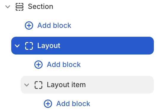
Layout blocks
About
Layout blocks provide sophisticated content organization options that go beyond simple text and images. These blocks serve as containers and structural elements that help create complex, visually appealing page designs while maintaining responsive behavior across all devices.
Layout block settings
| Setting name | Description |
|---|---|
| Type | Choose layout type: Grid, Carousel, Masonry. |
| Column | Adjust the column of layout: from 1 to 12. |
| Gap | Adjust the gap of columns: Global, Custom. |
| Width | Adjust the width of layout: Fill, Custom. |
| Fixed row | Adjust the height of the rows in the layout by percentage: from 1 to 90. |
| Padding | Adjust the padding of layout: Top, Bottom, Left, Right. |
Layout item block settings
| Setting name | Description |
|---|---|
| Column span | Adjust column span number: from 1 to 12. |
| Row span | Adjust row span number: from 1 to 12. |
| Link | Add link to the layout item. |
| Layout | Adjust the direction and position of items: Direction, Alignment, Position, Gap, Reverse, Clip overflow content, Hide on mobile, Absolute. |
| Size | Adjust the size of the layout item: Width, Height, Max width. |
| Appearance | Adjust: Color scheme, Background type, Corner radius, Border. |
| Trigger on parent hover | Turn of Parent when you need to adjust hover effect to items child. |
| Animation | Adjust the show-up animation of items when scrolling after the page loads: None, Global, Custom. |
| Padding | Adjust the padding of layout item: Top, Bottom, Left, Right. |